As eCommerce designers, it’s easy to find ourselves in a typography echo chamber. Trends move fast among DTC brands, and typeface choices and execution can lean towards a more utilitarian mindset. That’s why it was so refreshing for our creative team to attend the 2022 Typographics Conference.
The conference spanned across 2-days, packed with 18 back-to-back speakers all working closely with typography. After many hours of speakers and type puns ensued, our creative team walked away from the conference inspired, motivated, and geared with new tools and skills to apply to our daily work at Tomorrow.
We’ve broken down a few of our favorite sessions, with our key takeaways and additional relevant resources below.
Donna Payne, “Faber Stories”
Donna Payne is a Creative Director at Faber & Faber, the UK’s leading independent publisher. As the first speaker, she kicked off the conference with enthusiasm and insight into the way typography plays a key role in book cover design.
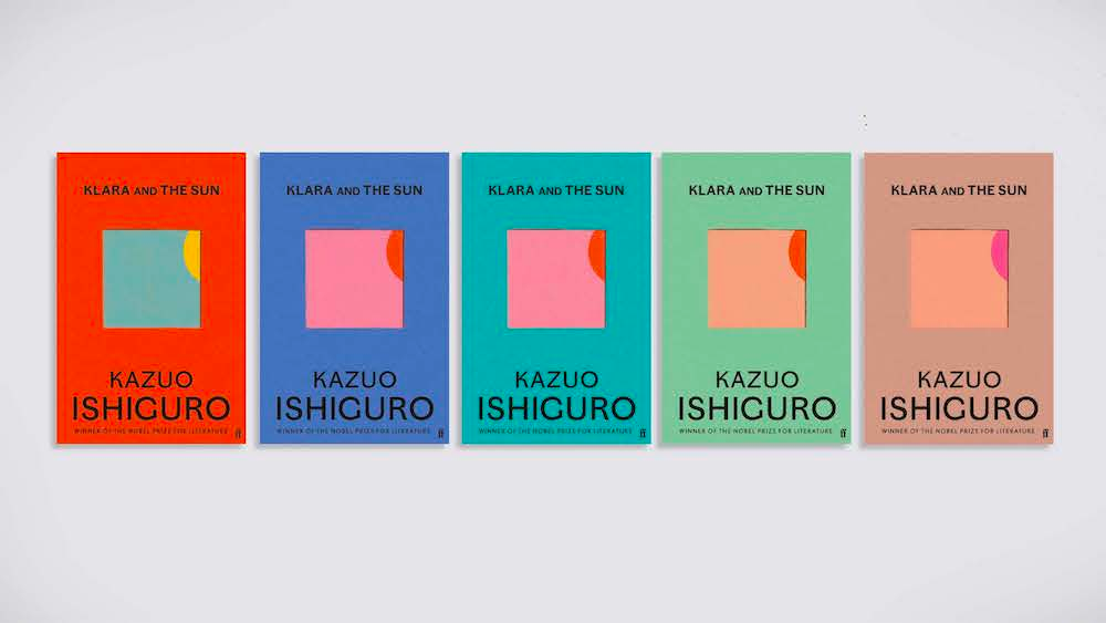
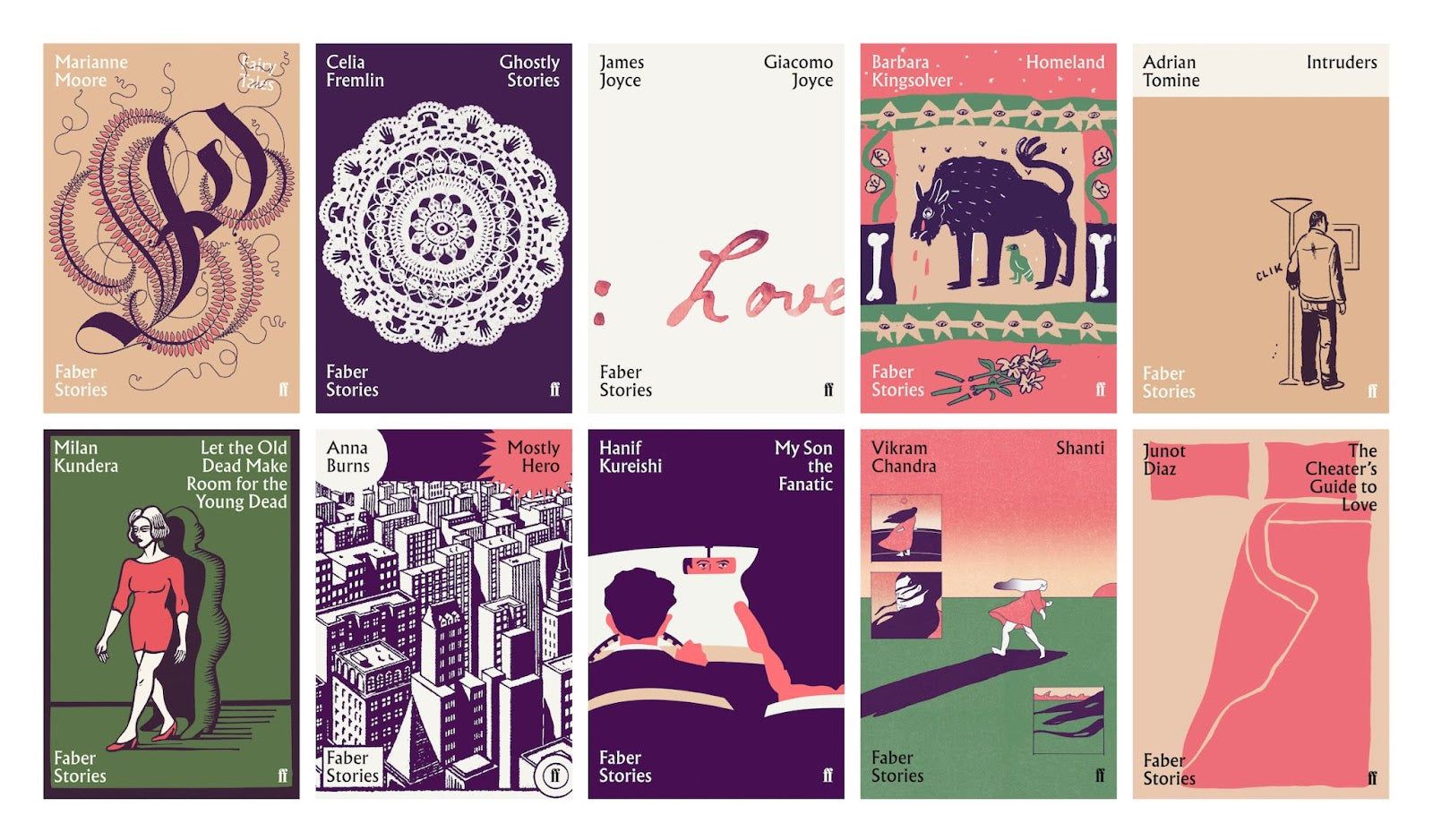
She walked through the creative process at Faber & Faber, highlighting her team’s recent work. She explained the nuances that typography has on designing the right book cover. Faber & Faber embraces many old school approaches - exploring hundreds of visual approaches and printing out work to consider. Although antiquated to some in the industry, she admittedly loves narrowing down cover art options to fit perfectly on the company’s display easel.
Related reading:
- Albertus typeface
- https://www.faber.co.uk/journal/the-albertus-typeface-and-fabers-design-heritage/
- Kuzuo Ishiguro Klara and the Sun cover designs
- Faber cover system
Abbott Miller, “Fonts by Proxy: Charismatic, Performative, Histrionic”
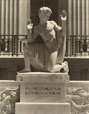
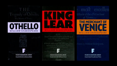
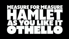
Abbott Miller, partner at Pentagram, explained how he uses typography to express a sense of time, place, and culture when he approaches brand identity projects. He highlighted recent projects, such as his rebranding for Shakespeare Theater — an identity that is partially derived from engraved text on a statue in front of the building. He emphasized the importance of immersing oneself in the project, truly understanding the project and its history, in order to understand how typography can be used as an expression of that.
Related work and press:
Shivani Parasnis, “Photographic Typography Memory”
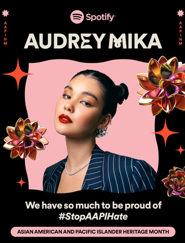
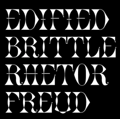
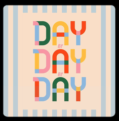
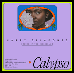
Shivani Parasnis, currently a designer at Spotify, energized the audience with her personal story around typography and how it has shaped her life trajectory. She discussed how, through playing with typography, she draws inspiration from her roots, finds joy in the everyday, and connects with those around her. While highlighting some of her recent projects at Spotify, she alluded to the fact that it can be challenging for creatives working in-house to use the same “safe” sans-serif brand typefaces day after day. However, for Spotify’s AAPIHM 2021 campaign, Shivani took the initiative to develop Heritage Display, a new brand typeface with eclectic letterforms that express the joy, creativity and diversity of the AAPI+ community. In the campaign creative, Spotify’s primary typeface Spotify Circular is sprinkled with letters from this display typeface and augmented by 3-D metallic illustrations and fun animations.
Continued reading:
- https://www.itsnicethat.com/articles/shivani-parasnis-graphic-design-201021
- https://www.instagram.com/p/CZmk_3jrE7J/
Pablo Delcan, “Make It”
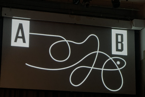
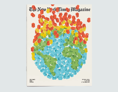
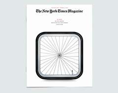
Pablo Delcan, a designer from Spain, spoke about the creative process, one that can take many shapes and forms. He embraces the transformation of the design process and encourages us to explore endless possibilities, regardless of whether they are good. He spoke about how, overtime he has actually felt too efficient in his process from getting from A to B. To create something truly special, the process often must take some unexpected turns and unpredictable deviations. He expresses how the experience of designing can be arduous and tedious, and tries to embrace the bad and messy to find joy.
Recent work:
Mucca, “From candies to caviar, how a font can extend its reach to the far corners of a brand”
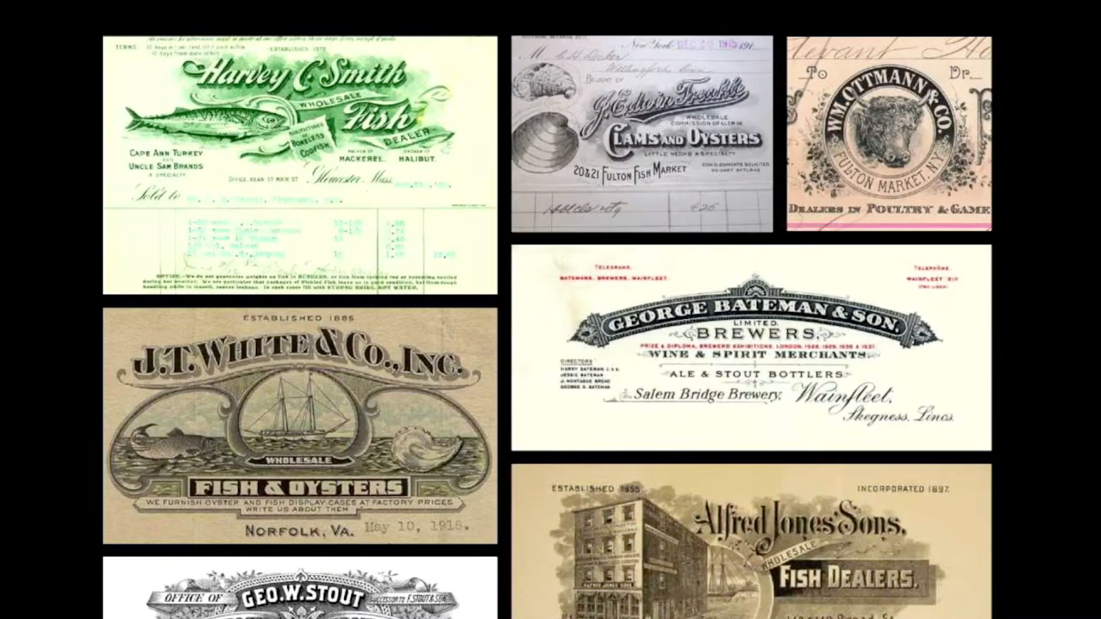
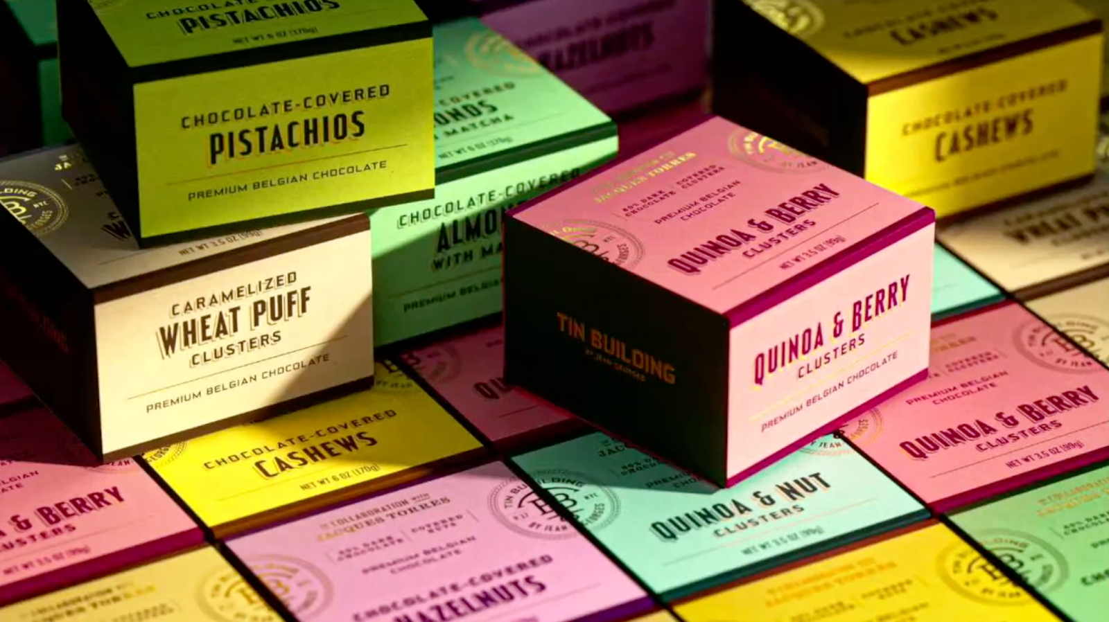
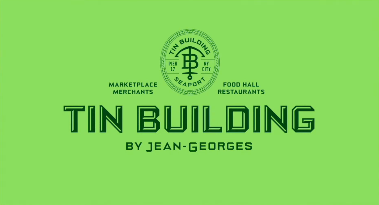
Matteo Bologna and Sean O’Connor, presented what is probably their most ambitious project: branding Jean-Georges Vongerichten’s massive new culinary complex, the Tin Building, including all its markets, restaurants, and products. For this project, they created a new variable font that was flexible enough to work on collateral as small as spice labels and as big as 30 ft signage.
With so many brands clamoring for attention on our small screens, and trends of maximalism overtaking pre-pandemic minimalism, variable fonts have become an increasingly popular tool for brands to stand out. This is in part due to improving software, such as Glyphs 3,which Matteo Bologna and his partner Andrea Trabucco-Campos recently rebranded. Now a single typeface can encompass serif and sans-serif, extended and condensed. https://www.creativeboom.com/resources/top-36-fonts-in-2022
While it would be impossible to give you a play-by-play of the conference, we wanted to highlight and share some of our favorite speakers. If interested in learning more you can also find all the talks on Youtube to experience the conference for yourself.
Day 1: https://youtu.be/I_u44thsAoU
Day 2: https://youtu.be/zce_5MVR7bY


